For years, neutrals meant white, beige, or gray, reliable, safe, and familiar colors. But today's design landscape is shifting. Browns, muted greens, and softened earth tones are redefining what it means to build a versatile foundation for your home, giving you more ways than ever to express your personal style without overwhelming a space.
Of course, color is only part of the story. The flooring you choose, along with its material, texture, finish, and the way light moves across it throughout the day, all play a powerful role in how a neutral palette truly comes to life. When these elements work in harmony, the result is a space that feels calm and grounded, yet full of warmth, depth, and character.
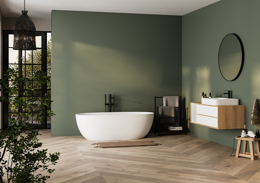
A neutral doesn't need to be colorless. It helps to think of neutral as the role a color plays in a room rather than a fixed list of shades.
A color can work as a neutral when it gives a versatile foundation to the materials, furniture, artwork, and finishes around it. Today, that role can be filled by:
That doesn't mean every muted color is automatically a neutral. A shade becomes useful as a neutral when it supports the larger vision instead of demanding all the attention. That simple shift opens up far more creative options for your home.
Design has been moving toward warmer, earth-influenced palettes. Instead of relying only on cool gray, many homeowners are drawn to colors with more nuanced undertones.
Natural materials play a big part in this shift. Wood and stone carry their own color, and warmer neutrals tend to sit comfortably beside them. The result is a palette that feels more connected to the materials in the room.
This is an evolution, not a replacement. Gray and white still work beautifully, but today's neutral palette simply offers a broader range of warm, thoughtful choices to consider.
Four color families stand out. Each one can anchor a room in its own way, especially when you see it alongside flooring, furniture, texture, and natural light.
Brown includes chocolate, espresso, caramel, chestnut, and walnut-inspired tones. What makes brown interesting is that it often appears in a room through materials before it ever shows up in paint.
You'll find it in:
A wood floor can help set the tonal direction for the entire room. Once the floor is in place, it becomes easier to choose wall colors, upholstery, and finishes that feel connected to it.
Mushroom, taupe, khaki, warm greige, and beige variations are ideal if you love traditional neutrals but want something with more nuance.
The key is undertone. Some of these shades lean warm, others lean slightly cool, and that difference changes how they sit next to wood. They also shift throughout the day as natural light moves through the room. A taupe that looks soft and pale in the morning may read richer by evening.
These colors pair especially well with textured materials, which add tonal variation and keep the palette from feeling too even.
Can green be a neutral? In its muted forms, yes.
Olive, sage, and moss can take on a supporting role when they're soft enough to let other elements share the stage. Their strength lies in how they interact with surrounding materials. A muted green can complement the grain of a wood floor, sit quietly beside stone, and give textiles and natural finishes a gentle backdrop.
Used this way, green becomes part of the room's foundation rather than its focal point.
Clay, muted terracotta, rust, and mineral-inspired shades round out the new neutral family. Still, not every terracotta color is a neutral.
Bright, saturated versions tend to dominate a space. Softer, muted versions can support the other elements in a room instead of overpowering them. That distinction matters. When the tone is dialed back, earth colors can create a grounded backdrop that works with wood, stone, and woven fabrics.
A beautiful neutral interior isn't created by finding five versions of beige. It comes from how several elements work together:
Two rooms with nearly identical colors can feel completely different depending on their materials. One may feel sleek and quiet. The other may feel relaxed and tactile.
A neutral palette gains variation through details like:
Flooring is often treated as something that has to "match" after every other choice is made. In reality, the floor is one of the largest visual surfaces in a room. It can help establish the palette from the very start.
Wood isn't simply "brown." A single floor can hold several related tones at once, from lighter streaks to deeper accents.
Grain, tonal variation, and light or dark values all play a role. Those tones can guide your choices elsewhere, including furniture and cabinetry. When you pull a color from the floor into other parts of the room, the space feels naturally connected.
In a restrained palette, carpet adds character through texture rather than dramatic color contrast.
Pile, pattern, and subtle shifts in color give carpet a quiet richness. A neutral carpet with gentle tonal variation can add dimension to a room while keeping the overall palette calm and comfortable underfoot.
Neutral doesn't have to mean visually uniform. Stone and tile bring movement, pattern, veining, and color variation to a room.
Finish matters too. A honed surface and a polished one can look very different in the same light. That natural variation gives a neutral space interest without adding another bold color.
A neutral room comes alive through small, intentional choices. These four approaches make it easy.
Use lighter and darker values from related color families. A pale taupe wall paired with a deeper mushroom sofa creates contrast without breaking the palette.
Let materials feel different even when their colors are similar. Think a nubby throw on a smooth leather chair, or a woven rug over a wood floor.
The way a surface responds to light shapes how it looks. Matte, satin, and polished finishes can make the same color feel soft, subtle, or bright.
Wood and stone bring their own pattern, grain, and color movement. Let them do some of the work for you.
The goal isn't to make every element match, but instead to create enough connection that the room feels intentional.
You don't have to redo an entire room to explore this approach. Choose the level of commitment that feels right for you.
Test a new neutral with easy-to-change pieces:
Once you've found shades you love, bring them into larger pieces:
When you're ready for a lasting change, set the tone with the room's biggest surfaces:
Starting with the foundation gives every other choice a clear direction to follow.
The new neutral isn't one particular color. It's a different approach to designing a room, where color, texture, finish, furnishings, and personal touches all come together to reflect how you actually live. Your floor is where that vision starts. It's one of the largest surfaces in your space, and the right one can shift the way every other element in the room looks and feels. Choose the shades and materials that feel right to you, then see exactly how they come together.
Use our Room Visualizer to explore flooring styles in your own space and see exactly how different tones, textures, and finishes come together. It's the easiest way to move from inspiration to a decision you'll feel confident about.